Before you write a single bullet, decide on the shape of your resume. Most of the resumes that look "off" do not have a writing problem - they have a structure problem. Sections in the wrong order, too many of them, or the wrong ones for the candidate's stage.
The sections that earn their place
For almost every career stage, the following sections, in this order, are the right starting point.
- Name and contact block. Name, location (city is enough), email, phone, and a single link - usually LinkedIn or a portfolio. No headshot. No "objective." No street address.
- Summary. Three or four lines arguing for why you fit the role. Optional only for the most junior candidates, where a strong education + project section can carry the top of the page instead.
- Experience. The main event. Reverse chronological order, with the most recent role first and the most detail. Older roles get progressively shorter.
- Education. Below experience for most candidates. Above experience only for current students and very recent graduates with limited work history.
- Skills. A short, specific block - tools, frameworks, languages, certifications. Not a wall of buzzwords.
That is the default. Almost every resume should start from there and adjust deliberately.
Optional sections - only when they add signal
Anything beyond the five sections above should have to earn its line on the page.
- Projects. Valuable for engineers, designers, and early-career candidates whose extracurricular work materially raises the bar of their application.
- Publications, talks, patents. Worth listing when the target role explicitly values them.
- Volunteer experience. Worth including when it represents serious, sustained work that the rest of the resume does not capture.
- Languages. List them if you actually use them at work or the role calls for them.
Cut everything else. Hobbies, "interests," favorite quotes, and decorative trivia do not belong on a professional resume.
How long it should be
Most candidates with fewer than ten years of experience should aim for one page. Senior candidates with deep, dense histories can extend to two - but only if the second page is dense with content, not white space. A two-page resume that is half-empty looks worse than a one-page resume that is well edited.
Choosing what to detail and what to compress
Recent and relevant jobs get the most lines. The further back you go, the fewer bullets each job needs. A six-year-old role can often be reduced to one or two lines. Roles older than ten to fifteen years can usually be removed entirely unless they directly support the narrative you are telling for the target role.
Visual structure: keep it boring on purpose
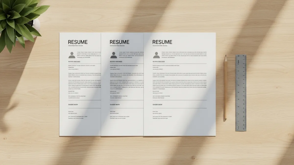
Use a single column. Use one font for everything. Use the same date format across every entry. Align dates to the right, role and company to the left. Avoid icons, gradients, and color blocks. A clean, predictable layout is read faster, parsed more reliably by ATS, and signals seriousness. The reader's brain has more to spend on your content when it does not have to navigate around your design.
One structural pass before you start editing bullets
Before you spend an hour rewriting your bullets, take ten minutes and fix the structure. Remove sections that do not earn their place, reorder the ones that remain, and decide how much room each job gets. By the time you start editing bullets, you will already have a resume that looks twice as professional as the version you started with.